• Home
  • / Blog

Two-tone kitchen furniture: combinations that work

Category:
  • Tips
  • /Inspiration
  • 04/05/2025
    Share this article in:


    A well-designed kitchen is much more than "simple" functionality. It needs something to give it character, personality and life. And that is where a trend that has been with us for some time now comes in and which, far from going out of fashion, seems to be consolidating itself as one of the favourite options in current projects: combining kitchen furniture in two tones.

    Incorporating two colours in the furniture not only has an aesthetic value; it can also help you to delimit areas, provide light, generate a feeling of spaciousness or warmth, and, why not say it, make your kitchen look a little more like you.

    If you are in the middle of redesigning your kitchen, read on. We bring you four combinations that work. Because yes, two-tone furniture can be your best ally if you know how to use them.

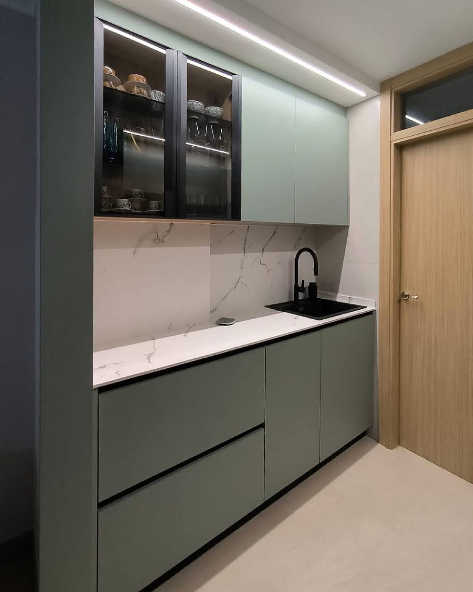
    Black green: natural sophistication

    This combination is pure elegance with a touch of nature. Green, especially in shades with a stronger blue pigment base, brings freshness and depth. Black, on the other hand, elevates the ensemble and fills it with character.

    When combined, they produce a very interesting balance between the natural and the urban. The result is a kitchen with presence, ideal for those who are looking for something different but without stridency.

    For example, this project by our distributor Arinay, in which he has introduced the colour black through our Bold display cabinet, with the frames in this tone. Adding other details in black, such as the gola profiles or the sink, gives it an extra point:


    Arinay CMD

    Oak blue: the perfect balance

    Deep blue has become one of the star colours for those looking for a kitchen with a sophisticated yet cosy touch. And if you combine it with the warmth of oak, the result couldn't be more balanced.

    This combination works wonders in open kitchens, especially if you want to create some continuity with the rest of the house without sacrificing visual impact. The blue gives depth and elegance, while the oak softens the whole and brings a sense of closeness.

    a trick? Use blue in the lower part of the furniture and reserve the oak for the upper part or for display cabinet type modules, which will provide visual lightness without losing strength.

    Although you can also play with contrast in the base units as NCA Interiores has done with the island in this project:


    NCA Interiores


    Alchagra oak: elegance with a warm soul

    Reddish tones such as almagra could not be more fashionable. They take us directly to the earth, the sun and noble materials. Combined with oak-effect finishes, it creates a warm and textured atmosphere.

    The almagra brings originality and a touch of craftsmanship, while the oak acts as a serene and natural base. The most interesting thing about this combo is that, depending on the other elements in the kitchen, it can create one atmosphere or another.

    If we add ceramic tiles or terracotta floors, the atmosphere will be more rustic and Mediterranean. If, as in the Madecort example, we incorporate marble-effect worktops and cladding, we can give an elegant and luminous touch:


    Madecort


    White walnut: timeless elegance

    And we close with a timeless combination that never fails. Walnut, with its intense grain and dark tone, is synonymous with sophistication. Combined with white, the result is a bright, elegant and well-balanced kitchen.

    This pairing is ideal for those who are looking for a long-lasting design that will not go out of fashion over time. White keeps the space clean and fresh, while walnut adds depth, texture and warmth.

    You can play with different proportions depending on the effect you are looking for: more white for small or dimly lit kitchens, more walnut if you want an enveloping space with a classic feel.

    Although the most "logical" thing to do would be to leave the darkest tone for the base units, this example from Universal Pavimentos shows us the opposite. We love the way walnut looks on the wall units and shelving:


    Universal Pavimentos

    We tell you which is your nearest dealer:
    You can also contact us via :
    • Facebook
    • Instagram
    • Linkedin
    • Pinterest
    Download our catalogue
    OB Cocinas
    CO - 3103 Km. 10 - 14420 - Villafranca - Córdoba (España)
    T: 0034 957 19 12 00
    Export: 0034 957 191 213
    Private area
    • Legal notice
    • Privacy policy
    • Política de Cookies